Visualization Templates
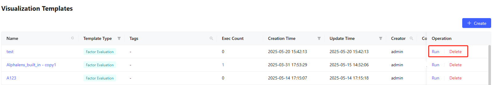
The visualization templates transform data into visual formats like graphs and charts, making data analysis more intuitive and accessible. The Visualization Templates tab displays displays all available visualization templates in a table with key information like name, template type, execution history, creation time, update time, creator, and comment. It includes several built-in templates for backtesting, attribution and factor evaluation.

Create New Template
Click + Create button and fill in the popup to create new templates:
- Select template type based on the data source. For example, choose "Factor Evaluation" type when visualizing factor evaluation results; choose "Custom" when working with other undefined types of data.
- Enter template name
- Add optional tags and comments for filtering
- Click Create and enter the editing page.
For existing template, click its name to enter the editing page. Use the Edit Description button to modify any settings (excluding Template Type).

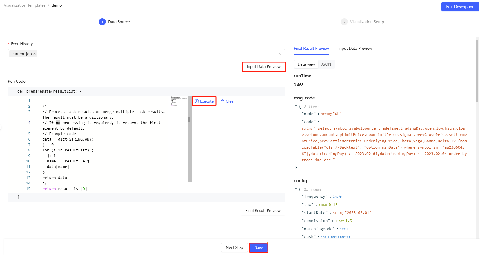
Step 1: Set up Data Source
- The data source can be either manually constructed or output from existing
execution records.
- For "Custom" templates: Add parameters that will be passed as dictionaries, with automatic assignment statements.
- For other template types: Choose execution record(s) whose results will be passed as tuples.
- Before writing code, you can examine your data source by clicking Input Data Preview. If multiple execution records are selected, they will be displayed in a collapsible panel. This operation is not supported for "Custom" templates.
- Write code to process your input data. Ensure your code returns results in dictionary form. During the writing process, you can test code by clicking Execute (or use Ctrl+E).
- After developing the code, preview the final results.
- Complete your data source setup by clicking Save, then proceed to visualization configuration by selecting Next Step.
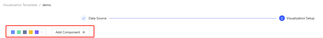
Step 2: Configure Visualization Options
- Set distinct colors for multiple data series in your charts and graphs via color themes.
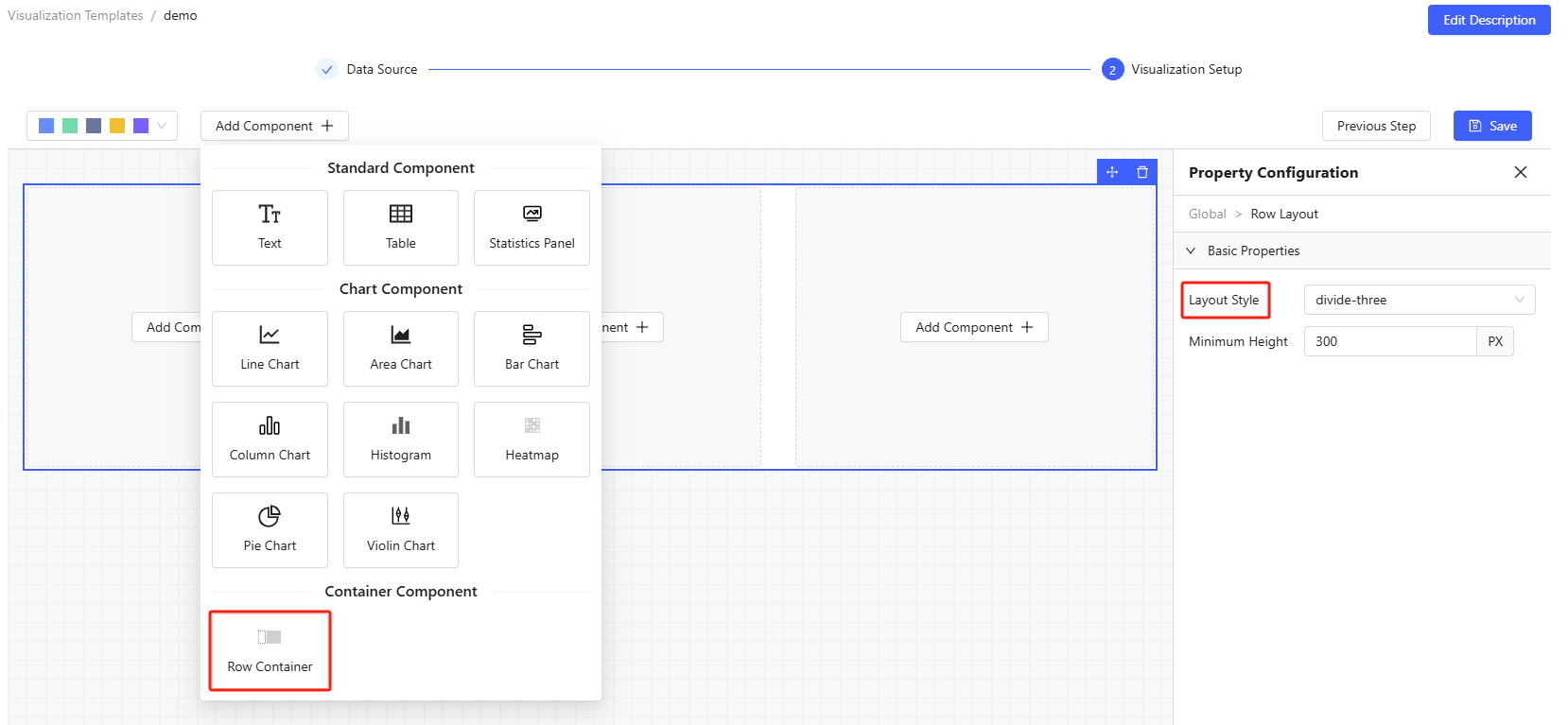
- Click Add Component to place new visualization elements at the end of your report as needed.
Where, a Row Container helps organize your components horizontally. By default, each row fits 3 components. You can customize row layouts through Basic Properties > Layout Style on the right tab. Currently, the available options are: full (occupies the entire row); divide-two; divide-three.
- Property Configuration allows you to customize your components.
- Basic Properties for table component include title, data
source, table size, and page size. Column Properties include
column names, value column (from data source), width, fixed column
(to the left or right), and formatting (number, percent or
time).
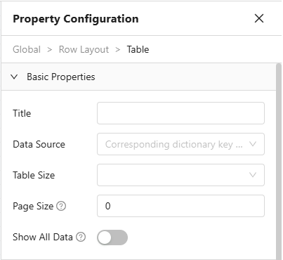
Figure 6. Basic Properties for Table 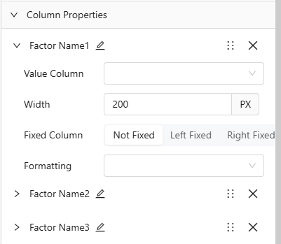
Figure 7. Column Properties for Table - Basic Properties for chart component include chart type,
title, data source, legend, tooltip, zoom slider, data label,
stacked group column name, and comparison group column name.
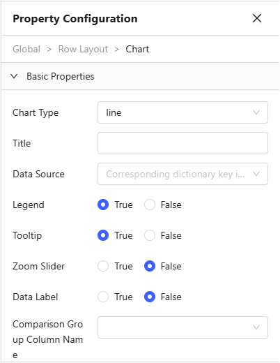
Figure 8. Basic Properties for Chart
- Basic Properties for table component include title, data
source, table size, and page size. Column Properties include
column names, value column (from data source), width, fixed column
(to the left or right), and formatting (number, percent or
time).
- Complete your Visualization setup by clicking Save, and you can back to data source setup by selecting Previous Step.
Run Visualization Templates
To use a template, click the Run button and choose the execution records you want to analyze. This will generate a visualization based on your selected template.
Delete Existing Templates
Visualization templates can be removed by admin, users with review permissions or the corresponding creator by clicking Delete.