Dashboard
Dashboard is a powerful data visualization and analysis tool designed to help users better understand and utilize data.
Dashboard has a wide range of applications in data analysis and resource monitoring, as it offers many powerful features and benefits, including:
-
Intuitive data visualization: Through various charts, Dashboard helps users transform data into understandable information, enabling deeper insight into business operations or resource monitoring.
-
Flexibility and customizability: Multiple chart types are available to meet the needs of different industries and use cases. Users can customize the layout, colors, data sources, etc., to meet their specific requirements.
-
Data interactivity: Dashboard supports user interaction with data, including filtering, searching, and other features to explore information in depth.
-
Real-time data updates: Through configuration, users can retrieve real-time data from multiple data sources to ensure they are always working with the latest information.
-
Security and permission management: Robust data security and permission management features ensure that only authorized users can access sensitive information.
The following sections describe how to create dashboards, generate charts, configure data sources, design visualizations, and share dashboards. Whether you are a beginner or an experienced user of related products, this article will help you quickly get started with these features.
Basic Concepts
To facilitate understanding, here are some key terms used in this article:
-
Dashboard: The main workspace used to organize and display multiple charts.
-
Chart: A visual representation of data.
-
Data source: A SQL query on data in DolphinDB or a subscription to a stream table.
-
Variable: Used to dynamically control query elements in Dashboard, allowing users to modify specific parameters of data sources at runtime for more flexible data analysis and presentation.
Permission Management
The data in Dashboard comes from DolphinDB. Administrators can configure user permissions in DolphinDB, ensuring that users can only view charts for databases, tables, or stream tables that they are authorized to access. For detailed permission rules, please refer to User Access Control.
Installation and Deployment
Deployment
Dashboard is supported only in the 2.00 seriesand is not currently supported in the 1.30 series.
Starting from version 2.00.11, Dashboard is built into the Web component, so no additional deployment for this feature is required after v2.00.11.
If you are using a version earlier than 2.00.11 and want to use Dashboard, download the latest installation package and replace the existing web folder with that from the latest installation package. If DolphinDB server is deployed in cluster mode, replace the Web folder on all corresponding node. The Web folder supports hot replacement, so there is no need to restart the cluster.
You can access the Web interface by entering <ip>:<port>
in your browser. The IP address and port specified here should point to a data
node or compute node.
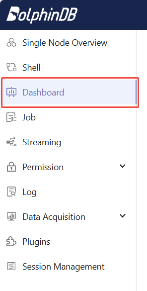
Dashboard is located in the left panel. Click it to open the Dashboard page.
Initialization
When using Dashboard for the first time, the admin user needs to perform initialization on the data node. This cannot be performed by other users or on other nodes.
-
After logging as admin on the Web interface, click Dashboard in the left panel, and then click Initialize .
-
For versions 2.00.11 and later, add the following configuration to the node's configuration file, and then restart the cluster to complete initialization.For standalone deployment, the configuration file is dolphindb.cfg.For cluster deployment, the configuration file is controller.cfg.For high-availability cluster deployment, modify the corresponding controller.cfg files on every controller.
thirdPartyCreateUserCallback=dashboard_grant_functionviews thirdPartyDeleteUserCallback=dashboard_delete_user -
For versions earlier than 2.00.11, no additional initialization steps are required. But note that: In versions earlier than 2.00.11, after initialization, when creating a new user, the admin must manually run the following command to grant the new user access to Dashboard. If the server is later upgraded to v2.00.11 or later, step 2 must be executed once.
dashboard_grant_functionviews(<newUserName>, NULL, false)
Basic Operations
Create a Dashboard
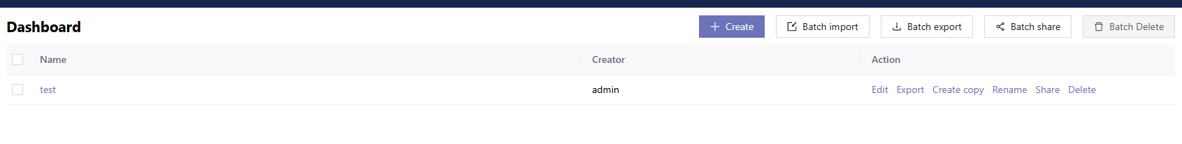
On the Dashboard page, click Create, enter the new dashboard's name, and click OK to create an empty dashboard.
Export and import: Back up and migrate existing dashboards. Import and export are performed using JSON files. When importing, make sure the JSON file content complies with the Dashboard configuration requirements.
Sharing: Shares a dashboard with other users via a link. Select a dashboard and click Batch share to obtain the link for corresponding dashboard, then you can share the link with other users in the cluster. When other users access the link, they should first log in to their accounts and can then enter preview mode, where editing is not allowed.
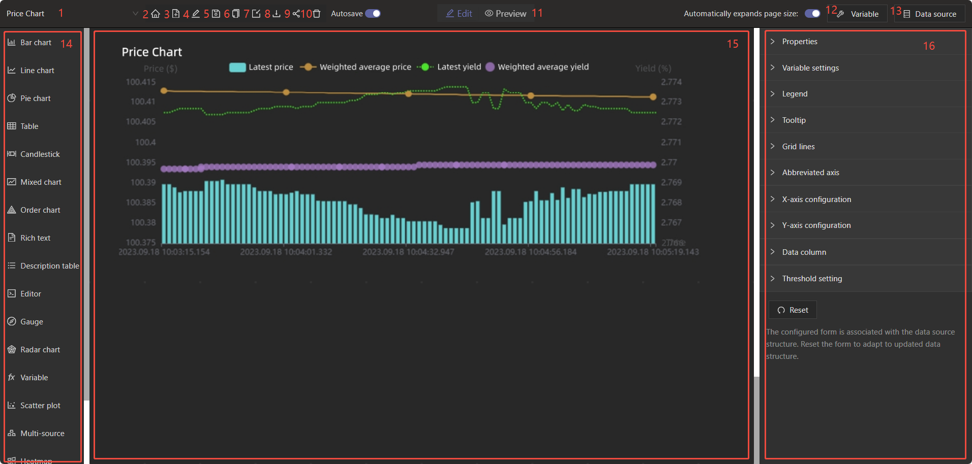
Edit a Dashboard
-
Switch dashboards: Switches between different dashboards on the current node.
-
Return to overview: Returns back to the Dashboard page.
-
Add: Creates an empty dashboard.
-
Rename: Changes the name of the current dashboard.
-
Save: Saves the current dashboard.
-
Create copy: Creates a copy of the current dashboard.
-
Import: Imports a dashboard by uploading a JSON file containing configuration information.
-
Export: Saves the configuration information of the current dashboard as a JSON file.
-
Share: Shares the current panel with other users via a link. Before sharing, make sure your latest changes have been saved.
-
Delete: Deletes the current dashboard.
-
Mode switch: Switches between edit mode and preview mode.
-
Variable: Variables defined by the current user, used for data sources and chart displays.
-
Data source: Sets the current user's data sources used for chart displays.
-
Chart list: All available charts for users to choose from.
-
Workspace: The area where users can edit and arrange charts.
-
Configuration panel: Displayed only when a chart in the workspace is selected, used to configure the current chart's information.
Configure Variables
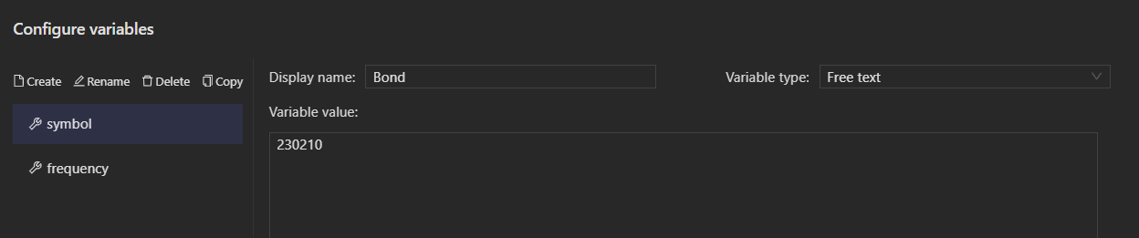
Create: Adds a new variable to the current dashboard.
Rename: Renames the current variable. The variable name will be displayed on the left side.
Delete: Deletes the current variable.
Copy: Copies the current variable. You can paste it with ctrl+v into the Configuration variables section of different dashboards.
Display name: The name of the variable displayed in the chart. For example, the variable "symbol" may be displayed in a chart as "Bond".
Variable type: Four types are supported: Single-select, Multi-select, Free text, and Date. For single-select and multi-select variables, you need to add options. The Options list is displayed when the type is set to single-select or multi-select.
Variable value: The current variable value. When creating a variable for the first time, you must set an initial value. For a single-select variable, once a variable value is selected, it cannot be deleted from the Options list. To delete it, you should first change the selected variable value.
When the variable type is single-select or multi-select, you can generate option values via SQL import. The SQL query must return a two-column table, with the first column used as the label and the second as the value.
Configure Data Source
Two types of data sources are supported: Table and Matrix. Matrix can only be used as the data source for Heatmap or Surface, and can be edited via DolphinDB SQL. While Table can be edited using either “DolphinDB SQL” or “Stream Table”.
Create: Adds a new data source to the current dashboard.
Rename: Renames the current data source. The data source name is displayed on the left side.
Delete: Deletes the current data source.
Copy: Copies the current data source. You can paste it with ctrl+v into the Configure data source section of another dashboard.
DolphinDB SQL: Edits the query in the code area:
-
To configure values with variables, click Insert a variable .
-
To retrieve the latest configuration, enable Auto refresh .
-
To control the number of rows displayed in the result, set Maximum rows to display . If not specified, all rows will be shown by default.
Stream Table: All stream tables on the current node will be listed on the left. You can also filter the list manually and search to select the required stream table to display:
-
When selecting a stream table, a preview of its column names appears on the right.
-
The "IP Port" at the bottom indicates the currently connected node.
-
"Filter" includes Column filter and Expression. Column filter requires using the
setStreamTableFilterColumnfunction in DolphinDB client to specify the columns to filter. Expression directly sets a conditional expression. Data not matching the condition will be filtered out, for examplecolName==3. -
To control the number of rows displayed in the result, set Maximum rows to display. If not specified, all rows will be shown by default.
Select Chart
Dashboard provides a variety of chart types, including bar chart, line chart, pie chart, table, OHLC chart, mixed chart, order chart, rich text, description table, editor, gauge, radar chart, variable, scatter plot, multi-source, heatmap, configuration chart, surface chart, etc.
Among these, bar chart, line chart, multi-source, scatter plot, and mixed chart support "Threshold setting". Using the "Threshold type", you can set threshold as either "Percentage" or "Absolute value". The percentage refers to the current maximum value of that axis. The "Display type" includes the following three options:
-
Do not display: Hides the threshold.
-
Area Fill: Fills the area between the current threshold and the next higher threshold with the corresponding color. For example, if the 20% threshold is set to green and the 80% threshold is set to red, the area from 20% to 80% is filled in green, and the area above 80% is filled in red.
-
Line: Marks the lower boundary of the area with a line. The line type, width, and color can be customized. For example, if the 20% threshold is set to green and the 80% threshold is set to red, a green line appears at 20% and a red line appears at 80%.
For visual examples of each chart, refer to Chart Overview.
Usage: Select the desired chart from the left panel, left-click and drag it to an empty area in the workspace. Then click Populate data source and select a data source.
After selecting the chart, you can adjust its position and size as needed.
The Copy button in the upper-right corner of the chart allows you to copy the current chart to the clipboard. You can then paste it with ctrl+v into the current dashboard or another one.
Note:
-
If there is not enough space on the dashboard to display charts, they may overlap. In that case, manually drag them to adjust their positions.
-
If you copy the chart first and then copy the data source, you need to Apply the data source again in the Configure data source section of the chart.
Example: Displaying an OHLC Chart with the Dashboard
Assume that the current DolphinDB node has a stream table, OHLCStream, which receives real-time OHLC data. The schema of OHLCStream is shown below. The column names with prefixes "m1_", "m5_", "m15_", "m30_", and "m60_" correspond to OHLC data for 1-minute, 5-minute, 15-minute, 30-minute, and 60-minute, respectively. And the column names with "open", "high", "low", "close", and "volume" represent the opening price, highest price, lowest price, closing price, and trading volume.
| name | typeString |
|---|---|
|
createTime |
TIMESTAMP |
|
SECURITYID |
SYMBOL |
|
m1_open |
DOUBLE |
|
m1_high |
DOUBLE |
|
m1_low |
DOUBLE |
|
m1_close |
DOUBLE |
|
m1_volume |
LONG |
|
m5_open |
DOUBLE |
|
m5_high |
DOUBLE |
|
m5_low |
DOUBLE |
|
m5_close |
DOUBLE |
|
m5_volume |
LONG |
|
m15_open |
DOUBLE |
|
m15_high |
DOUBLE |
|
m15_low |
DOUBLE |
|
m15_close |
DOUBLE |
|
m15_volume |
LONG |
|
m30_open |
DOUBLE |
|
m30_high |
DOUBLE |
|
m30_low |
DOUBLE |
|
m30_close |
DOUBLE |
|
m30_volume |
LONG |
|
m60_open |
DOUBLE |
|
m60_high |
DOUBLE |
|
m60_low |
DOUBLE |
|
m60_close |
DOUBLE |
|
m60_volume |
LONG |
Create a Dashboard
Click Create , enter "OHLC Chart" as the new dashboard name, and click OK to create an empty dashboard.
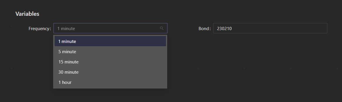
Configure Variables
-
Click Edit at the top center of the page to switch to edit mode.
-
Click Variable > Create and name the new variable "frequency":Set Display name to "Frequency"Set Variable type to "Single-select"Add five options. Set the labels to "1 minute," "5 minutes," "15 minutes," "30 minutes," and "1 hour," with corresponding values of "m1_", "m5_", "m15_", "m30_", and "m60_", respectively.Choose a Variable value among the options, for example, "1 Minute."
-
Click Save .
-
Click Variable > Create and name a new variable "symbol":
-
Set Display name to "Bond"
-
Set Variable type to "Free text"
-
Set Variable value to any value of the SECURITYID column in the stream table, for example, 230210.
-
Click Save .
Configure Data Source
Click Data source > Create , and name the new data source "OHLC." On the right side, select "DolphinDB SQL" and enter the following script:
select createtime, securityid, decimal32({{frequency}}high,4) as high,{{frequency}}low as low,{{frequency}}close as close,{{frequency}}open as open,{{frequency}}volume as volume,ma({{frequency}}close, 5, 1) as ma5, ma({{frequency}}close, 10, 1) as ma10, ma({{frequency}}close, 20, 1) as ma20, ma({{frequency}}close, 60, 1) as ma60 from OHLCStream where securityid == '{{symbol}}'In the script, insert the variables configured in the previous step into
{{frequency}} and {{symbol}} by clicking
Insert Variable below and selecting "frequency" and
"symbol."
Enable "Auto refresh", set the "Interval" to 1s, set the "Maximum rows to display" to 150, and click "Save."
Configure Chart
-
Drag the OHLC Chart from the left into the blank area of the workspace. Click Populate data source , and select the previously configured data source "OHLC."
-
Click the chart and configure its properties on the right panel:
-
Properties: Set Title to "OHLC," and adjust parameters such as title font size and padding as needed.Set Tooltip to "Yes" to display the data value when the cursor hovers over a point on the chart.Slider indicates whether the axis slider is enabled. Here, set the "X-axis slider" to "Yes" so that you can use the mouse wheel to adjust the time window on the chart.
-
Variable settings: The variables "frequency" and "symbol" were inserted during data source configuration, so select "frequency" and "symbol" in Associated variables . Variables per row specifies the number of adjustable variables displayed in each row of the chart. Set it to 2.Set Query button to "Yes." Since "symbol" is a free-text variable, real-time querying during text entry would consume unnecessary resources. Therefore, with this button set to "Yes," after variable values are changed, the changes take effect only when the button is clicked.Button text: The Query button can be renamed if desired.
-
X-axis configuration: Set Type to Time Axis, Name to "Time," Axis column to "createtime," and Time format to "HH:mm:ss."
-
Y-Axis configuration: Y-Axis 1: Set the Type to "Numerical Axis," the Name to "ohlc," and the Position to "Left."Y-Axis 2: Set the Type to "Numerical Axis," the Name to "Trading Volume," and the Position to "Right."
-
Data column: Data column 1: The “open, close, lowest, and highest” corresponding to the table fields "open", "high", "low", and "close" respectively, associated with the "ohlc" Y-axis.Data column 2: The “Trading volume” corresponding to the “volume” field, associated with the "Trading Volume" Y-axis.Click Add data column to add data columns 3, 4, 5, and 6. Set Data column to their names "ma5", "ma10", "ma20", and "ma60" respectively, associated with the "ohlc" Y-axis.
Note:
After completing all the above configurations, be sure to click Save in the toolbar at the top of the panel to save your settings.
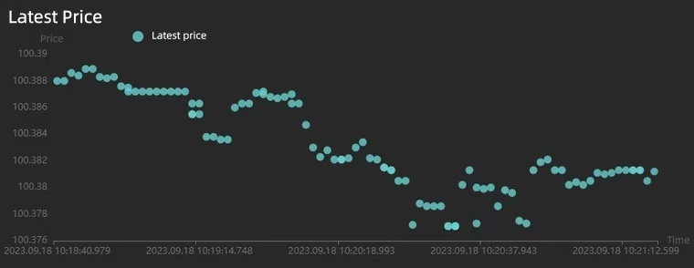
The OHLC chart will appear as shown below:
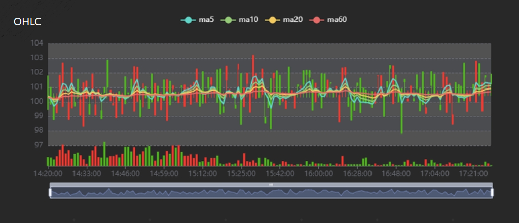
Chart Overview
Dashboard provides a variety of chart types, including bar chart, line chart, pie chart, table, OHLC chart, mixed chart, order chart, rich text, description table, editor, gauge, radar chart, variable, scatter plot, multi-source, heatmap, configuration chart, surface chart, etc. The following sections will introduce the relevant configurations for each chart type.
Bar Chart
The data source type must be table.
Properties
| Configuration | Description |
|---|---|
|
Title |
Sets the chart title, which appears in the upper-left corner of the chart. |
|
Title Font Size |
Sets the title font size. |
|
Top |
Sets the height of the empty area at the top of the chart. |
|
Bottom |
Sets the height of the empty area at the bottom of the chart. |
|
Left |
Sets the width of the empty area on the left side of the chart. |
|
Right |
Sets the width of the empty area on the right side of the chart. |
|
Animation |
Sets whether to enable chart rendering animation. |
Variable settings
| Configuration | Description |
|---|---|
|
Associated Variables |
Sets the variable controls displayed at the top of the chart. |
|
Variables per Row |
Sets the number of variable controls displayed in each row at the top of the chart. |
|
Label Placeholder |
Sets the percentage of space occupied by the variable label relative to the individual variable control. |
|
Query Button |
Sets whether to display a query button on the right side of the variables:
|
|
Button Text |
Sets the text displayed on the query button. |
Legend
| Configuration | Description |
|---|---|
|
Display |
Sets whether to display the chart legend. |
|
Layout |
Sets the legend layout. Options include Horizontal and Vertical layouts. |
|
Legend Type |
Sets the legend type. Options include General and Scrollable:
|
|
Position |
Sets the legend position. You can specify the legend's distance from the Top, Bottom, Left, and Right sides of the chart. The following value types are supported:
|
|
Legend Spacing |
Sets the spacing between legend items. For horizontal layout, this refers to horizontal spacing; for vertical layout, it refers to vertical spacing. |
|
Font Size |
Sets the size of the legend text. |
|
Marker Size |
Sets the size of the legend markers. |
|
Text Color |
Sets the legend text color. |
Tooltip
| Configuration | Description |
|---|---|
|
Display |
Sets whether to display the tooltip when hovering over a data point. |
Grid lines
| Configuration | Description |
|---|---|
|
Display |
Sets whether to display chart grid lines on the chart. |
|
Line Color |
Sets the color of the chart grid lines. |
|
Line Width |
Sets the width of the grid lines. |
|
Line Type |
Sets the grid line style. Options are Solid, Dashed, and Dotted. |
Slider
| Configuration | Description |
|---|---|
|
X-Axis Slider |
Sets whether to display the X-axis slider. |
|
Y-Axis Slider |
Sets whether to display the Y-axis slider. |
X-axis configuration
| Configuration | Description |
|---|---|
|
Type |
Sets the axis type:
|
|
Name |
Sets the axis name. |
|
Font Size |
Sets the font size of the axis text, including the axis name and tick labels. |
|
Font Color |
Sets the color of the axis text, including the axis name and tick labels. |
|
Line Color |
Sets the color of the axis line. |
|
Axis Column |
Sets the X-axis coordinate column. Available options are the column names from the data source. |
|
Time Format (Displayed when Type is Time axis or Category axis) |
Sets the X-axis time format. The available options are as follows:
|
|
Include Zero (Displayed When the Type is Value Axis) |
Sets whether the axis scale must include a zero tick. |
|
Tick Interval (Displayed When the Type is Value Axis) |
Sets a fixed interval between axis divisions. |
|
Minimum (Displayed When the Type is Value Axis) |
Sets the minimum value for the axis ticks. |
|
Maximum (Displayed when the axis type is Value Axis) |
Sets the maximum value for the axis ticks. |
|
Base (Displayed when the axis type is Logarithmic Axis) |
Sets the base of the logarithmic axis. |
Y-axis configuration
Note:
You can configure multiple Y-axes.
| Configuration | Description |
|---|---|
|
Type |
Sets the axis type:
|
|
Name |
Sets the axis name. |
|
Font Size |
Sets the font size of the axis text, including the axis name and tick labels. |
|
Font Color |
Sets the color of the axis text, including the axis name and tick labels. |
|
Line Color |
Sets the color of the axis line. |
|
Position |
Sets the axis position. Options are Left and Right. |
|
Offset |
Sets the offset of the Y-axis relative to its default left or right position. |
|
Time Format (Displayed when Type is Time axis or Category axis) |
Sets the Y-axis time format. The available options are as follows:
|
|
Include Zero (Displayed When the Type is Value Axis) |
Sets whether the axis scale must include a zero tick. |
|
Tick Interval (Displayed When the Type is Value Axis) |
Sets a fixed interval between axis divisions. |
|
Minimum (Displayed When the Type is Value Axis) |
Sets the minimum value for the axis ticks. |
|
Maximum (Displayed when the axis type is Value Axis) |
Sets the maximum value for the axis ticks. |
|
Base (Displayed when the axis type is Logarithmic Axis) |
Sets the base of the logarithmic axis. |
Data column
Note:
You can configure multiple data columns.
| Configuration | Description |
|---|---|
|
Data Column |
Sets the data source column associated with this column. |
|
Name |
Sets the data column name. |
|
Type (Non-selectable) |
Default is Bar Chart. |
|
Color |
Sets the bar color. |
|
Associated Y-Axis |
Sets the Y-axis associated with the data column. |
|
Marker Points |
Sets markers for this data column. Options include Maximum, Minimum, or a custom data value. |
|
Horizontal Line |
Sets chart reference lines. Options include Maximum, Minimum, Average value, or a custom data value. |
|
Stack Value |
Sets the stack value. Data columns with the same stack value will be stacked together. |
Threshold setting
Note:
Thresholds can be configured for multiple data axes. Each threshold setting applies to one axis. If multiple threshold settings are configured for the same axis, only the first one will be applied.
| Configuration | Description |
|---|---|
|
Associated Axis Type |
Sets the axis type associated with the threshold. Options are X-axis and Y-axis. |
|
Associated X/Y-Axis |
Sets the axis associated with the threshold (only selectable for Value axis). |
|
Display Type |
Sets the display type for the threshold. Options include Do-not display, Area fill, or Line. |
|
Threshold Settings |
Sets the threshold color and threshold value. You can add or delete thresholds:
|
Reset
Resets the configuration on the right panel. When the data source changes, you need to reset the configuration to match the latest data source structure.
Line Chart
The data source type must be table.
Properties
| Configuration | Description |
|---|---|
|
Title |
Sets the chart title, which appears in the upper-left corner of the chart. |
|
Title Font Size |
Sets the title font size. |
|
Top |
Sets the height of the empty area at the top of the chart. |
|
Bottom |
Sets the height of the empty area at the bottom of the chart. |
|
Left |
Sets the width of the empty area on the left side of the chart. |
|
Right |
Sets the width of the empty area on the right side of the chart. |
|
Animation |
Sets whether to enable chart rendering animation. |
Variable settings
| Configuration | Description |
|---|---|
|
Associated Variables |
Sets the variable controls displayed at the top of the chart. |
|
Variables per Row |
Sets the number of variable controls displayed in each row at the top of the chart. |
|
Label Placeholder |
Sets the percentage of space occupied by the variable label relative to the individual variable control. |
|
Query Button |
Sets whether to display a query button on the right side of the variables:
|
|
Button Text |
Sets the text displayed on the query button. |
Legend
| Configuration | Description |
|---|---|
|
Display |
Sets whether to display the chart legend. |
|
Layout |
Sets the legend layout. Options include Horizontal and Vertical layouts. |
|
Legend Type |
Sets the legend type. Options include General and Scrollable:
|
|
Position |
Sets the legend position. You can specify the legend's distance from the Top, Bottom, Left, and Right sides of the chart. The following value types are supported:
|
|
Legend Spacing |
Sets the spacing between legend items. For horizontal layout, this refers to horizontal spacing; for vertical layout, it refers to vertical spacing. |
|
Font Size |
Sets the size of the legend text. |
|
Marker Size |
Sets the size of the legend markers. |
|
Text Color |
Sets the legend text color. |
Tooltip
| Configuration | Description |
|---|---|
|
Display |
Sets whether to display the tooltip when hovering over a data point. |
Grid lines
| Configuration | Description |
|---|---|
|
Display |
Sets whether to display chart grid lines on the chart. |
|
Line Color |
Sets the color of the chart grid lines. |
|
Line Width |
Sets the width of the grid lines. |
|
Line Type |
Sets the grid line style. Options are Solid, Dashed, and Dotted. |
Slider
| Configuration | Description |
|---|---|
|
X-Axis Slider |
Sets whether to display the X-axis slider. |
|
Y-Axis Slider |
Sets whether to display the Y-axis slider. |
X-axis configuration
| Configuration | Description |
|---|---|
|
Type |
Sets the axis type:
|
|
Name |
Sets the axis name. |
|
Font Size |
Sets the font size of the axis text, including the axis name and tick labels. |
|
Font Color |
Sets the color of the axis text, including the axis name and tick labels. |
|
Line Color |
Sets the color of the axis line. |
|
Axis Column |
Sets the X-axis coordinate column. Available options are the column names from the data source. |
|
Time Format (Displayed when Type is Time axis or Category axis) |
Sets the X-axis time format. The available options are as follows:
|
|
Include Zero (Displayed When the Type is Value Axis) |
Sets whether the axis scale must include a zero tick. |
|
Tick Interval (Displayed When the Type is Value Axis) |
Sets a fixed interval between axis divisions. |
|
Minimum (Displayed When the Type is Value Axis) |
Sets the minimum value for the axis ticks. |
|
Maximum (Displayed when the axis type is Value Axis) |
Sets the maximum value for the axis ticks. |
|
Base (Displayed when the axis type is Logarithmic Axis) |
Sets the base of the logarithmic axis. |
Y-axis configuration
Note:
You can configure multiple Y-axes.
| Configuration | Description |
|---|---|
|
Type |
Sets the axis type:
|
|
Name |
Sets the axis name. |
|
Font Size |
Sets the font size of the axis text, including the axis name and tick labels. |
|
Font Color |
Sets the color of the axis text, including the axis name and tick labels. |
|
Line Color |
Sets the color of the axis line. |
|
Position |
Sets the axis position. Options are Left and Right. |
|
Offset |
Sets the offset of the Y-axis relative to its default left or right position. |
|
Time Format (Displayed when Type is Time axis or Category axis) |
Sets the Y-axis time format. The available options are as follows:
|
|
Include Zero (Displayed When the Type is Value Axis) |
Sets whether the axis scale must include a zero tick. |
|
Tick Interval (Displayed When the Type is Value Axis) |
Sets a fixed interval between axis divisions. |
|
Minimum (Displayed When the Type is Value Axis) |
Sets the minimum value for the axis ticks. |
|
Maximum (Displayed when the axis type is Value Axis) |
Sets the maximum value for the axis ticks. |
|
Base (Displayed when the axis type is Logarithmic Axis) |
Sets the base of the logarithmic axis. |
Data column
Note:
You can configure multiple data columns.
| Configuration | Description |
|---|---|
|
Data Column |
Sets the data source column associated with this column. |
|
Name |
Sets the data column name. |
|
Type (Non-selectable) |
Default is Bar Chart. |
|
Color |
Sets the bar color. |
|
Associated Y-Axis |
Sets the Y-axis associated with the data column. |
|
Marker Points |
Sets markers for this data column. Options include Maximum, Minimum, or a custom data value. |
|
Horizontal Line |
Sets chart reference lines. Options include Maximum, Minimum, Average value, or a custom data value. |
|
Stack Value |
Sets the stack value. Data columns with the same stack value will be stacked together. |
Threshold setting
Note:
Thresholds can be configured for multiple data axes. Each threshold setting applies to one axis. If multiple threshold settings are configured for the same axis, only the first one will be applied.
| Configuration | Description |
|---|---|
|
Associated Axis Type |
Sets the axis type associated with the threshold. Options are X-axis and Y-axis. |
|
Associated X/Y-Axis |
Sets the axis associated with the threshold (only selectable for Value axis). |
|
Display Type |
Sets the display type for the threshold. Options include Do-not display, Area fill, or Line. |
|
Threshold Settings |
Sets the threshold color and threshold value. You can add or delete thresholds:
|
Reset
Resets the configuration on the right panel. When the data source changes, you need to reset the configuration to match the latest data source structure.
Pie Chart
The data source type must be table.
A pie chart supports up to 9 colors.
Properties
| Configuration | Description |
|---|---|
|
Title |
Sets the chart title, which appears in the upper-left corner of the chart. |
|
Title Font Size |
Sets the title font size. |
|
Top |
Sets the height of the empty area at the top of the chart. |
|
Bottom |
Sets the height of the empty area at the bottom of the chart. |
|
Left |
Sets the width of the empty area on the left side of the chart. |
|
Right |
Sets the width of the empty area on the right side of the chart. |
|
Animation |
Sets whether to enable chart rendering animation. |
Variable settings
| Configuration | Description |
|---|---|
|
Associated Variables |
Sets the variable controls displayed at the top of the chart. |
|
Variables per Row |
Sets the number of variable controls displayed in each row at the top of the chart. |
|
Label Placeholder |
Sets the percentage of space occupied by the variable label relative to the individual variable control. |
|
Query Button |
Sets whether to display a query button on the right side of the variables:
|
|
Button Text |
Sets the text displayed on the query button. |
Legend
| Configuration | Description |
|---|---|
|
Display |
Sets whether to display the chart legend. |
|
Layout |
Sets the legend layout. Options include Horizontal and Vertical layouts. |
|
Legend Type |
Sets the legend type. Options include General and Scrollable:
|
|
Position |
Sets the legend position. You can specify the legend's distance from the Top, Bottom, Left, and Right sides of the chart. The following value types are supported:
|
|
Legend Spacing |
Sets the spacing between legend items. For horizontal layout, this refers to horizontal spacing; for vertical layout, it refers to vertical spacing. |
|
Font Size |
Sets the size of the legend text. |
|
Marker Size |
Sets the size of the legend markers. |
|
Text Color |
Sets the legend text color. |
Tooltip
| Configuration | Description |
|---|---|
|
Display |
Sets whether the tooltip is displayed when hovering over a data point. |
Donut Chart
| Option | Description |
|---|---|
|
Data Column |
Sets the data source column associated with the data values in the donut chart. |
|
Category Column |
Sets the data source column associated with the categories in the donut chart. |
Reset
Resets the configuration on the right panel. When the data source changes, you need to reset the configuration to match the latest data source structure.
Table
The data source type must be table.
Properties
| Configuration | Description |
|---|---|
|
Title |
Sets the chart title, which appears in the upper-left corner of the chart. |
|
Title Font Size |
Sets the title font size. |
|
Top |
Sets the height of the empty area at the top of the chart. |
|
Bottom |
Sets the height of the empty area at the bottom of the chart. |
|
Left |
Sets the width of the empty area on the left side of the chart. |
|
Right |
Sets the width of the empty area on the right side of the chart. |
|
Animation |
Sets whether to enable chart rendering animation. |
Variable settings
| Configuration | Description |
|---|---|
|
Associated Variables |
Sets the variable controls displayed at the top of the chart. |
|
Variables per Row |
Sets the number of variable controls displayed in each row at the top of the chart. |
|
Label Placeholder |
Sets the percentage of space occupied by the variable label relative to the individual variable control. |
|
Query Button |
Sets whether to display a query button on the right side of the variables:
|
|
Button Text |
Sets the text displayed on the query button. |
Column Configuration
Note:
Under Column configuration, you can configure all columns of the data source.
| Configuration | Description |
|---|---|
|
Data Column (Non-selectable) |
Sets the data source column. |
|
Display |
Sets whether to display the current column in the table. |
|
Displayed Name |
Sets the header name of the current column. |
|
Column Width |
Sets the width of the current column. |
|
Column Style |
Sets the style of the current table column. From left to right, the options are font size, text color, and column background color. |
|
Header Style |
Sets the header style of the current column. From left to right, the options are font size, text color, and column background color. |
|
Threshold |
Sets a threshold for the current column. This applies only to numeric columns. When a threshold is set, values above it are shown with a gradient red background, while values below it are shown with a gradient green background. The greater the difference between the value and the threshold, the darker the color. |
|
Time Format |
Sets the time format for the current column. |
|
Scale |
Sets the number of decimal places for the current column. |
|
Thousands Separator |
Sets whether the current column should be formatted with thousands separators, for example, 1,000,000. |
|
Alignment |
Sets the column alignment. Options: left, center, or right. |
|
Sort |
Sets whether the column is sortable. The sorting is performed by directly subtracting one value from another, so non-numeric types may not sort correctly. |
Pagination Settings
| Configuration | Description |
|---|---|
|
Pagination Required |
Sets whether the table uses pagination. |
OHLC Chart
The data source type must be table.
Properties
| Configuration | Description |
|---|---|
|
Title |
Sets the chart title, which appears in the upper-left corner of the chart. |
|
Title Font Size |
Sets the title font size. |
|
Top |
Sets the height of the empty area at the top of the chart. |
|
Bottom |
Sets the height of the empty area at the bottom of the chart. |
|
Left |
Sets the width of the empty area on the left side of the chart. |
|
Right |
Sets the width of the empty area on the right side of the chart. |
|
Animation |
Sets whether to enable chart rendering animation. |
Variable settings
| Configuration | Description |
|---|---|
|
Associated Variables |
Sets the variable controls displayed at the top of the chart. |
|
Variables per Row |
Sets the number of variable controls displayed in each row at the top of the chart. |
|
Label Placeholder |
Sets the percentage of space occupied by the variable label relative to the individual variable control. |
|
Query Button |
Sets whether to display a query button on the right side of the variables:
|
|
Button Text |
Sets the text displayed on the query button. |
Legend
| Configuration | Description |
|---|---|
|
Display |
Sets whether to display the chart legend. |
|
Layout |
Sets the legend layout. Options include Horizontal and Vertical layouts. |
|
Legend Type |
Sets the legend type. Options include General and Scrollable:
|
|
Position |
Sets the legend position. You can specify the legend's distance from the Top, Bottom, Left, and Right sides of the chart. The following value types are supported:
|
|
Legend Spacing |
Sets the spacing between legend items. For horizontal layout, this refers to horizontal spacing; for vertical layout, it refers to vertical spacing. |
|
Font Size |
Sets the size of the legend text. |
|
Marker Size |
Sets the size of the legend markers. |
|
Text Color |
Sets the legend text color. |
Tooltip
| Configuration | Description |
|---|---|
|
Display |
Sets whether the tooltip is displayed when hovering over a data point. |
Grid lines
| Configuration | Description |
|---|---|
|
Display |
Sets whether to display chart grid lines on the chart. |
|
Line Color |
Sets the color of the chart grid lines. |
|
Line Width |
Sets the width of the grid lines. |
|
Line Type |
Sets the grid line style. Options are Solid, Dashed, and Dotted. |
Slider
| Configuration | Description |
|---|---|
|
X-Axis Slider |
Sets whether to display the X-axis slider. |
|
Y-Axis Slider |
Sets whether to display the Y-axis slider. |
X-axis configuration
| Configuration | Description |
|---|---|
|
Type (Non-selectable) |
Only Time axis is supported. |
|
Name |
Sets the axis name. |
|
Font Size |
Sets the font size of the axis text. |
|
Axis Column |
Sets the X-axis coordinate column. |
|
Time Format |
Sets the X-axis time format. The available options are as follows:
|
|
Start Time |
Sets the start time displayed on the X-axis. |
|
End Time |
Sets the end time displayed on the X-axis. |
Y-axis configuration
The OHLC chart uses a dual Y-axis configuration: the first Y-axis is used for OHLC data, and the second Y-axis is used to display trading volume.
| Configuration | Description |
|---|---|
|
Type |
Only Value axis is supported. |
|
Name |
Sets the axis name. |
|
Font Size |
Sets the font size of the axis text. |
|
Minimum |
Sets the minimum value for the Y-axis. |
|
Maximum |
Sets the maximum value for the Y-axis. |
|
Position |
Sets the axis position. Options are Left and Right. |
|
Offset |
Sets the offset of the Y-axis relative to its default left or right position. |
Data column
Note:
You can configure multiple data columns.
| Configuration | Description |
|---|---|
|
open |
Sets the data source column associated with the open value. |
|
close |
Sets the data source column associated with the close value. |
|
lowest |
Sets the data source column associated with the lowest value. |
|
highest |
Sets the data source column associated with the highest value. |
|
Associated Y-axis |
Sets the Y-axis associated with the data column. |
|
Bar Color (Up) |
Sets the color for the bar when it rises. |
|
Bar Color (Down) |
Sets the color for the bar when it falls. |
Configuration for the trading volume data column:
| Configuration | Description |
|---|---|
|
Trading Volume |
Sets the data source column associated with the trading volume. |
|
Associated Y-Axis |
Sets the Y-axis associated with the data column. |
Other data columns:
| Configuration | Description |
|---|---|
|
Data Column |
Sets the data source column associated with this data column. |
|
Name |
Sets the data column name. |
|
Type (Non-selectable) |
Default is Line chart. |
|
Associated Y-Axis |
Sets the Y-axis associated with the data column. |
|
Line Color |
Sets the line color for the data column. |
|
Marker Points |
Sets markers for this data column. Options include Maximum, Minimum, or a custom data value. |
|
Horizontal Line |
Sets chart reference lines. Options include Maximum, Minimum, Average value, or a custom data value. |
|
Line Type |
Sets the line type. Options include Solid, Dashed, and Dotted. |
Reset
Resets the configuration on the right panel. When the data source changes, you need to reset the configuration to match the latest data source structure.
Mixed Chart
The data source type must be table.
Properties
| Configuration | Description |
|---|---|
|
Title |
Sets the chart title, which appears in the upper-left corner of the chart. |
|
Title Font Size |
Sets the title font size. |
|
Top |
Sets the height of the empty area at the top of the chart. |
|
Bottom |
Sets the height of the empty area at the bottom of the chart. |
|
Left |
Sets the width of the empty area on the left side of the chart. |
|
Right |
Sets the width of the empty area on the right side of the chart. |
|
Animation |
Sets whether to enable chart rendering animation. |
Variable settings
| Configuration | Description |
|---|---|
|
Associated Variables |
Sets the variable controls displayed at the top of the chart. |
|
Variables per Row |
Sets the number of variable controls displayed in each row at the top of the chart. |
|
Label Placeholder |
Sets the percentage of space occupied by the variable label relative to the individual variable control. |
|
Query Button |
Sets whether to display a query button on the right side of the variables:
|
|
Button Text |
Sets the text displayed on the query button. |
Legend
| Configuration | Description |
|---|---|
|
Display |
Sets whether to display the chart legend. |
|
Layout |
Sets the legend layout. Options include Horizontal and Vertical layouts. |
|
Legend Type |
Sets the legend type. Options include General and Scrollable:
|
|
Position |
Sets the legend position. You can specify the legend's distance from the Top, Bottom, Left, and Right sides of the chart. The following value types are supported:
|
|
Legend Spacing |
Sets the spacing between legend items. For horizontal layout, this refers to horizontal spacing; for vertical layout, it refers to vertical spacing. |
|
Font Size |
Sets the size of the legend text. |
|
Marker Size |
Sets the size of the legend markers. |
|
Text Color |
Sets the legend text color. |
Tooltip
| Configuration | Description |
|---|---|
|
Display |
Sets whether to display the tooltip when hovering over a data point. |
Grid lines
| Configuration | Description |
|---|---|
|
Display |
Sets whether to display chart grid lines on the chart. |
|
Line Color |
Sets the color of the chart grid lines. |
|
Line Width |
Sets the width of the grid lines. |
|
Line Type |
Sets the grid line style. Options are Solid, Dashed, and Dotted. |
Slider
| Configuration | Description |
|---|---|
|
X-Axis Slider |
Sets whether to display the X-axis slider. |
|
Y-Axis Slider |
Sets whether to display the Y-axis slider. |
X-axis configuration
| Configuration | Description |
|---|---|
|
Type |
Sets the axis type:
|
|
Name |
Sets the axis name. |
|
Font Size |
Sets the font size of the axis text, including the axis name and tick labels. |
|
Font Color |
Sets the color of the axis text, including the axis name and tick labels. |
|
Line Color |
Sets the color of the axis line. |
|
Axis Column |
Sets the X-axis coordinate column. Available options are the column names from the data source. |
|
Time Format (Displayed when Type is Time axis or Category axis) |
Sets the X-axis time format. The available options are as follows:
|
|
Include Zero (Displayed When the Type is Value Axis) |
Sets whether the axis scale must include a zero tick. |
|
Tick Interval (Displayed When the Type is Value Axis) |
Sets a fixed interval between axis divisions. |
|
Minimum (Displayed When the Type is Value Axis) |
Sets the minimum value for the axis ticks. |
|
Maximum (Displayed when the axis type is Value Axis) |
Sets the maximum value for the axis ticks. |
|
Base (Displayed when the axis type is Logarithmic Axis) |
Sets the base of the logarithmic axis. |
Y-axis configuration
Note:
You can configure multiple Y-axes.
| Configuration | Description |
|---|---|
|
Type |
Sets the axis type:
|
|
Name |
Sets the axis name. |
|
Font Size |
Sets the font size of the axis text, including the axis name and tick labels. |
|
Font Color |
Sets the color of the axis text, including the axis name and tick labels. |
|
Line Color |
Sets the color of the axis line. |
|
Position |
Sets the axis position. Options are Left and Right. |
|
Offset |
Sets the offset of the Y-axis relative to its default left or right position. |
|
Time Format (Displayed when Type is Time axis or Category axis) |
Sets the Y-axis time format. The available options are as follows:
|
|
Include Zero (Displayed When the Type is Value Axis) |
Sets whether the axis scale must include a zero tick. |
|
Tick Interval (Displayed When the Type is Value Axis) |
Sets a fixed interval between axis divisions. |
|
Minimum (Displayed When the Type is Value Axis) |
Sets the minimum value for the axis ticks. |
|
Maximum (Displayed when the axis type is Value Axis) |
Sets the maximum value for the axis ticks. |
|
Base (Displayed when the axis type is Logarithmic Axis) |
Sets the base of the logarithmic axis. |
Data column
The available data column types are: Bar chart, Line chart, and Scatter plot.
-
Bar chart: Same configurations as the Data Column of Bar Chart.
-
Line chart: Same configurations as the Data Column of Line Chart.
-
Scatter plot: Same configurations as the Data Column of Scatter Plot.
Threshold setting
Note:
Thresholds can be configured for multiple data axes. Each threshold setting applies to one axis. If multiple threshold settings are configured for the same axis, only the first one will be applied.
| Configuration | Description |
|---|---|
|
Associated Axis Type |
Sets the axis type associated with the threshold. Options are X-axis and Y-axis. |
|
Associated X/Y-Axis |
Sets the axis associated with the threshold (only selectable for Value axis). |
|
Display Type |
Sets the display type for the threshold. Options include Do-not display, Area fill, or Line. |
|
Threshold Settings |
Sets the threshold color and threshold value. You can add or delete thresholds:
|
Reset
Resets the configuration on the right panel. When the data source changes, you need to reset the configuration to match the latest data source structure.
Order Chart
The data source type must be table, and must include the fields sendingTime, bidmdEntryPrice, and offermdEntryPrice.
Properties
| Configuration | Description |
|---|---|
|
Title |
Sets the chart title, which appears in the upper-left corner of the chart. |
|
Title Font Size |
Sets the title font size. |
|
Top |
Sets the height of the empty area at the top of the chart. |
|
Bottom |
Sets the height of the empty area at the bottom of the chart. |
|
Left |
Sets the width of the empty area on the left side of the chart. |
|
Right |
Sets the width of the empty area on the right side of the chart. |
|
Animation |
Sets whether to enable chart rendering animation. |
Variable settings
| Configuration | Description |
|---|---|
|
Associated Variables |
Sets the variable controls displayed at the top of the chart. |
|
Variables per Row |
Sets the number of variable controls displayed in each row at the top of the chart. |
|
Label Placeholder |
Sets the percentage of space occupied by the variable label relative to the individual variable control. |
|
Query Button |
Sets whether to display a query button on the right side of the variables:
|
|
Button Text |
Sets the text displayed on the query button. |
Order chart
| Configuration | Description |
|---|---|
|
Bar Color |
Sets the color of the order chart bars. |
|
Curve Color |
Sets the color of the order chart curves. |
|
Multiplier |
Sets the multiplier for the order chart. |
|
Level of Quotes |
Sets the level of quotes for the order chart. |
Reset
Resets the configuration on the right panel. When the data source changes, you need to reset the configuration to match the latest data source structure.
Rich Text
No data source required; only text configuration is needed.
Description Table
The data source type must be table.
Properties
| Configuration | Description |
|---|---|
|
Title |
Sets the chart title, which appears in the upper-left corner of the chart. |
|
Title Font Size |
Sets the title font size. |
|
Top |
Sets the height of the empty area at the top of the chart. |
|
Bottom |
Sets the height of the empty area at the bottom of the chart. |
|
Left |
Sets the width of the empty area on the left side of the chart. |
|
Right |
Sets the width of the empty area on the right side of the chart. |
|
Animation |
Sets whether to enable chart rendering animation. |
Variable settings
| Configuration | Description |
|---|---|
|
Associated Variables |
Sets the variable controls displayed at the top of the chart. |
|
Variables per Row |
Sets the number of variable controls displayed in each row at the top of the chart. |
|
Label Placeholder |
Sets the percentage of space occupied by the variable label relative to the individual variable control. |
|
Query Button |
Sets whether to display a query button on the right side of the variables:
|
|
Button Text |
Sets the text displayed on the query button. |
Column attributes
| Configuration | Description |
|---|---|
|
Label Column |
Sets the data source column associated with the label in the description table. |
|
Value Column |
Sets the data source column associated with the value in the description table. |
|
Label Font Size |
Sets the label font size. |
|
Value Font Size |
Sets the value font size. |
|
Items per Row |
Sets the number of labels to display per row in the table. |
|
Label Column Configuration |
After selecting the label column, you can configure unique properties for each label-value pair based on the data source. |
Label Column Configuration
| Configuration | Description |
|---|---|
|
Value Color |
Set the text color for the value. |
|
Threshold |
Set the threshold for the value. |
|
Color below Threshold |
Sets the color for values below the threshold. Displayed when a threshold is set. If not set, it defaults to green. |
|
Color above Threshold |
Sets the color for values above the threshold. Displayed when a threshold is set. If not set, it defaults to red. |
|
Time Format |
Set the time format for values. The available options are as follows:
|
|
Scale |
Sets the number of decimal places. |
|
Thousands Separator |
Sets whether the current column should be formatted with thousands separators, for example, 1,000,000. |
Reset
Resets the configuration on the right panel. When the data source changes, you need to reset the configuration to match the latest data source structure.
Editor
No data source required.
Properties
| Configuration | Description |
|---|---|
|
Title |
Sets the title of the editor. |
|
Text for the Run Button |
Sets the text for the run button. |
Gauge
The data source type must be table.
Properties
| Configuration | Description |
|---|---|
|
Title |
Sets the chart title, which appears in the upper-left corner of the chart. |
|
Title Font Size |
Sets the title font size. |
|
Top |
Sets the height of the empty area at the top of the chart. |
|
Bottom |
Sets the height of the empty area at the bottom of the chart. |
|
Left |
Sets the width of the empty area on the left side of the chart. |
|
Right |
Sets the width of the empty area on the right side of the chart. |
|
Animation |
Sets whether to enable chart rendering animation. |
Variable settings
| Configuration | Description |
|---|---|
|
Associated Variables |
Sets the variable controls displayed at the top of the chart. |
|
Variables per Row |
Sets the number of variable controls displayed in each row at the top of the chart. |
|
Label Placeholder |
Sets the percentage of space occupied by the variable label relative to the individual variable control. |
|
Query Button |
Sets whether to display a query button on the right side of the variables:
|
|
Button Text |
Sets the text displayed on the query button. |
Data configuration
| Configuration | Description |
|---|---|
|
Minimum |
Sets the minimum value for the gauge. |
|
Maximum |
Sets the maximum value for the gauge. |
|
Label Font Size |
Sets the font size for the gauge labels. |
|
Value Font Size |
Sets the font size for the displayed values. |
|
Precision |
Sets the precision for the values. |
|
Number of Segments |
Sets the number of segments for the gauge scale. |
Data column configuration
Note: You can configure multiple data columns.
| Configuration | Description |
|---|---|
|
Data Column |
Sets the data source column associated with the data. Note: The data displayed on the gauge is the first data item from the data source column. |
|
Name |
Sets the name of the data column. |
|
Pointer Color |
Sets the color of the pointer for this data column. |
|
Title Horizontal Offset |
Sets the horizontal offset of the column title relative to the center of the gauge. |
|
Title Vertical Offset |
Sets the vertical offset of the column title relative to the center of the gauge. |
|
Value Horizontal Offset |
Sets the horizontal offset of the value relative to the center of the gauge. |
|
Value Vertical Offset |
Sets the vertical offset of the value relative to the center of the gauge. |
Reset
Resets the configuration on the right panel. When the data source changes, you need to reset the configuration to match the latest data source structure.
Radar Chart
The data source type must be table.
Properties
| Configuration | Description |
|---|---|
|
Title |
Sets the chart title, which appears in the upper-left corner of the chart. |
|
Title Font Size |
Sets the title font size. |
|
Top |
Sets the height of the empty area at the top of the chart. |
|
Bottom |
Sets the height of the empty area at the bottom of the chart. |
|
Left |
Sets the width of the empty area on the left side of the chart. |
|
Right |
Sets the width of the empty area on the right side of the chart. |
|
Animation |
Sets whether to enable chart rendering animation. |
Variable settings
| Configuration | Description |
|---|---|
|
Associated Variables |
Sets the variable controls displayed at the top of the chart. |
|
Variables per Row |
Sets the number of variable controls displayed in each row at the top of the chart. |
|
Label Placeholder |
Sets the percentage of space occupied by the variable label relative to the individual variable control. |
|
Query Button |
Sets whether to display a query button on the right side of the variables:
|
|
Button Text |
Sets the text displayed on the query button. |
Legend
| Configuration | Description |
|---|---|
|
Display |
Sets whether to display the chart legend. |
|
Layout |
Sets the legend layout. Options include Horizontal and Vertical layouts. |
|
Legend Type |
Sets the legend type. Options include General and Scrollable:
|
|
Position |
Sets the legend position. You can specify the legend's distance from the Top, Bottom, Left, and Right sides of the chart. The following value types are supported:
|
|
Legend Spacing |
Sets the spacing between legend items. For horizontal layout, this refers to horizontal spacing; for vertical layout, it refers to vertical spacing. |
|
Font Size |
Sets the size of the legend text. |
|
Marker Size |
Sets the size of the legend markers. |
|
Text Color |
Sets the legend text color. |
Tooltip
| Configuration | Description |
|---|---|
|
Display |
Sets whether to display the tooltip when hovering over a data point. |
Label column
| Configuration | Description |
|---|---|
|
Label Column |
Sets the data source column associated with the radar chart category labels. |
Data column
Note:
You can configure multiple data columns, and each column can have the same content.
|
Configuration |
Description |
|
Data Column |
Sets the data source column associated with the radar chart category data. |
|
Maximum |
Sets the maximum value for this category. |
Reset
Resets the configuration on the right panel. When the data source changes, you need to reset the configuration to match the latest data source structure.
Variable
No data source required.
Properties
| Configuration | Description |
|---|---|
|
Title |
Sets the chart title, which appears in the upper-left corner of the chart. |
|
Title Font Size |
Sets the title font size. |
|
Top |
Sets the height of the empty area at the top of the chart. |
|
Bottom |
Sets the height of the empty area at the bottom of the chart. |
|
Left |
Sets the width of the empty area on the left side of the chart. |
|
Right |
Sets the width of the empty area on the right side of the chart. |
|
Animation |
Sets whether to enable chart rendering animation. |
Variable settings
| Configuration | Description |
|---|---|
|
Associated Variables |
Sets the variable controls displayed at the top of the chart. |
|
Variables per Row |
Sets the number of variable controls displayed in each row at the top of the chart. |
|
Label Placeholder |
Sets the percentage of space occupied by the variable label relative to the individual variable control. |
|
Query Button |
Sets whether to display a query button on the right side of the variables:
|
|
Button Text |
Sets the text displayed on the query button. |
Reset
Resets the configuration on the right panel. When the data source changes, you need to reset the configuration to match the latest data source structure.
Scatter Plot
The data source type must be table.
Properties
| Configuration | Description |
|---|---|
|
Title |
Sets the chart title, which appears in the upper-left corner of the chart. |
|
Title Font Size |
Sets the title font size. |
|
Top |
Sets the height of the empty area at the top of the chart. |
|
Bottom |
Sets the height of the empty area at the bottom of the chart. |
|
Left |
Sets the width of the empty area on the left side of the chart. |
|
Right |
Sets the width of the empty area on the right side of the chart. |
|
Animation |
Sets whether to enable chart rendering animation. |
Variable settings
| Configuration | Description |
|---|---|
|
Associated Variables |
Sets the variable controls displayed at the top of the chart. |
|
Variables per Row |
Sets the number of variable controls displayed in each row at the top of the chart. |
|
Label Placeholder |
Sets the percentage of space occupied by the variable label relative to the individual variable control. |
|
Query Button |
Sets whether to display a query button on the right side of the variables:
|
|
Button Text |
Sets the text displayed on the query button. |
Legend
| Configuration | Description |
|---|---|
|
Display |
Sets whether to display the chart legend. |
|
Layout |
Sets the legend layout. Options include Horizontal and Vertical layouts. |
|
Legend Type |
Sets the legend type. Options include General and Scrollable:
|
|
Position |
Sets the legend position. You can specify the legend's distance from the Top, Bottom, Left, and Right sides of the chart. The following value types are supported:
|
|
Legend Spacing |
Sets the spacing between legend items. For horizontal layout, this refers to horizontal spacing; for vertical layout, it refers to vertical spacing. |
|
Font Size |
Sets the size of the legend text. |
|
Marker Size |
Sets the size of the legend markers. |
|
Text Color |
Sets the legend text color. |
Tooltip
| Configuration | Description |
|---|---|
|
Display |
Sets whether to display the tooltip when hovering over a data point. |
Grid lines
| Configuration | Description |
|---|---|
|
Display |
Sets whether to display chart grid lines on the chart. |
|
Line Color |
Sets the color of the chart grid lines. |
|
Line Width |
Sets the width of the grid lines. |
|
Line Type |
Sets the grid line style. Options are Solid, Dashed, and Dotted. |
Slider
| Configuration | Description |
|---|---|
|
X-Axis Slider |
Sets whether to display the X-axis slider. |
|
Y-Axis Slider |
Sets whether to display the Y-axis slider. |
X-axis configuration
| Configuration | Description |
|---|---|
|
Type |
Sets the axis type:
|
|
Name |
Sets the axis name. |
|
Font Size |
Sets the font size of the axis text, including the axis name and tick labels. |
|
Font Color |
Sets the color of the axis text, including the axis name and tick labels. |
|
Line Color |
Sets the color of the axis line. |
|
Axis Column |
Sets the X-axis coordinate column. Available options are the column names from the data source. |
|
Time Format (Displayed when Type is Time axis or Category axis) |
Sets the X-axis time format. The available options are as follows:
|
|
Include Zero (Displayed When the Type is Value Axis) |
Sets whether the axis scale must include a zero tick. |
|
Tick Interval (Displayed When the Type is Value Axis) |
Sets a fixed interval between axis divisions. |
|
Minimum (Displayed When the Type is Value Axis) |
Sets the minimum value for the axis ticks. |
|
Maximum (Displayed when the axis type is Value Axis) |
Sets the maximum value for the axis ticks. |
|
Base (Displayed when the axis type is Logarithmic Axis) |
Sets the base of the logarithmic axis. |
Y-axis configuration
Note:
You can configure multiple Y-axes.
| Configuration | Description |
|---|---|
|
Type |
Sets the axis type:
|
|
Name |
Sets the axis name. |
|
Font Size |
Sets the font size of the axis text, including the axis name and tick labels. |
|
Font Color |
Sets the color of the axis text, including the axis name and tick labels. |
|
Line Color |
Sets the color of the axis line. |
|
Position |
Sets the axis position. Options are Left and Right. |
|
Offset |
Sets the offset of the Y-axis relative to its default left or right position. |
|
Time Format (Displayed when Type is Time axis or Category axis) |
Sets the Y-axis time format. The available options are as follows:
|
|
Include Zero (Displayed When the Type is Value Axis) |
Sets whether the axis scale must include a zero tick. |
|
Tick Interval (Displayed When the Type is Value Axis) |
Sets a fixed interval between axis divisions. |
|
Minimum (Displayed When the Type is Value Axis) |
Sets the minimum value for the axis ticks. |
|
Maximum (Displayed when the axis type is Value Axis) |
Sets the maximum value for the axis ticks. |
|
Base (Displayed when the axis type is Logarithmic Axis) |
Sets the base of the logarithmic axis. |
Data column
Note:
You can configure multiple data columns, and each column can have the same content.
| Configuration | Description |
|---|---|
|
Data Column |
Sets the data source column. |
|
Name |
Sets the data column name. |
|
Type (Non-selectable) |
Default is Scatter plot. |
|
Color |
Sets the bar color. |
|
Associated Y-Axis |
Sets the Y-axis associated with the data column. |
|
Marker Points |
Sets markers for this data column. Options include Maximum, Minimum, or a custom data value. |
|
Horizontal Line |
Sets chart reference lines. Options include Maximum, Minimum, Average value, or a custom data value. |
|
Scatter Size |
Sets the size of the scatter points. |
|
Scatter Marker |
Sets the marker for the scatter points. Options include: circle, rect, roundRect, triangle, diamond, pin, and arrow. |
Threshold setting
Note:
Thresholds can be configured for multiple data axes. Each threshold setting applies to one axis. If multiple threshold settings are configured for the same axis, only the first one will be applied.
| Configuration | Description |
|---|---|
|
Associated Axis Type |
Sets the axis type associated with the threshold. Options are X-axis and Y-axis. |
|
Associated X/Y-Axis |
Sets the axis associated with the threshold (only selectable for Value axis). |
|
Display Type |
Sets the display type for the threshold. Options include Do-not display, Area fill, or Line. |
|
Threshold Settings |
Sets the threshold color and threshold value. You can add or delete thresholds:
|
Reset
Resets the configuration on the right panel. When the data source changes, you need to reset the configuration to match the latest data source structure.
Multi-Source
You can select multiple data sources within this chart, displaying data from multiple sources on a single chart.
Properties
| Configuration | Description |
|---|---|
|
Title |
Sets the chart title, which appears in the upper-left corner of the chart. |
|
Title Font Size |
Sets the title font size. |
|
Top |
Sets the height of the empty area at the top of the chart. |
|
Bottom |
Sets the height of the empty area at the bottom of the chart. |
|
Left |
Sets the width of the empty area on the left side of the chart. |
|
Right |
Sets the width of the empty area on the right side of the chart. |
|
Animation |
Sets whether to enable chart rendering animation. |
|
Auto Charting |
Sets whether to enable auto plot mode. When enabled, the first X-axis data source column will be used as the X-axis data, and all numerical columns from the data sources will be plotted as data columns, with the default chart type being a line chart. |
|
X-axis Type |
Displayed when Auto charting is enabled, used to set the X-axis type. If not selected, it defaults to time-based. |
Variable settings
| Configuration | Description |
|---|---|
|
Associated Variables |
Sets the variable controls displayed at the top of the chart. |
|
Variables per Row |
Sets the number of variable controls displayed in each row at the top of the chart. |
|
Label Placeholder |
Sets the percentage of space occupied by the variable label relative to the individual variable control. |
|
Query Button |
Sets whether to display a query button on the right side of the variables:
|
|
Button Text |
Sets the text displayed on the query button. |
Legend
| Configuration | Description |
|---|---|
|
Display |
Sets whether to display the chart legend. |
|
Layout |
Sets the legend layout. Options include Horizontal and Vertical layouts. |
|
Legend Type |
Sets the legend type. Options include General and Scrollable:
|
|
Position |
Sets the legend position. You can specify the legend's distance from the Top, Bottom, Left, and Right sides of the chart. The following value types are supported:
|
|
Legend Spacing |
Sets the spacing between legend items. For horizontal layout, this refers to horizontal spacing; for vertical layout, it refers to vertical spacing. |
|
Font Size |
Sets the size of the legend text. |
|
Marker Size |
Sets the size of the legend markers. |
|
Text Color |
Sets the legend text color. |
Tooltip
| Configuration | Description |
|---|---|
|
Display |
Sets whether to display the tooltip when hovering over a data point. |
Grid lines
| Configuration | Description |
|---|---|
|
Display |
Sets whether to display chart grid lines on the chart. |
|
Line Color |
Sets the color of the chart grid lines. |
|
Line Width |
Sets the width of the grid lines. |
|
Line Type |
Sets the grid line style. Options are Solid, Dashed, and Dotted. |
Slider
| Configuration | Description |
|---|---|
|
X-Axis Slider |
Sets whether to display the X-axis slider. |
|
Y-Axis Slider |
Sets whether to display the Y-axis slider. |
X-axis configuration
| Configuration | Description |
|---|---|
|
Type |
Sets the axis type:
|
|
Name |
Sets the axis name. |
|
Font Size |
Sets the font size of the axis text, including the axis name and tick labels. |
|
Font Color |
Sets the color of the axis text, including the axis name and tick labels. |
|
Line Color |
Sets the color of the axis line. |
|
Axis Column |
Sets the X-axis coordinate column. Available options are the column names from the data source. |
|
Time Format (Displayed when Type is Time axis or Category axis) |
Sets the X-axis time format. The available options are as follows:
|
|
Include Zero (Displayed When the Type is Value Axis) |
Sets whether the axis scale must include a zero tick. |
|
Tick Interval (Displayed When the Type is Value Axis) |
Sets a fixed interval between axis divisions. |
|
Minimum (Displayed When the Type is Value Axis) |
Sets the minimum value for the axis ticks. |
|
Maximum (Displayed when the axis type is Value Axis) |
Sets the maximum value for the axis ticks. |
|
Base (Displayed when the axis type is Logarithmic Axis) |
Sets the base of the logarithmic axis. |
Y-axis configuration
Note:
You can configure multiple Y-axes.
| Configuration | Description |
|---|---|
|
Type |
Sets the axis type:
|
|
Name |
Sets the axis name. |
|
Font Size |
Sets the font size of the axis text, including the axis name and tick labels. |
|
Font Color |
Sets the color of the axis text, including the axis name and tick labels. |
|
Line Color |
Sets the color of the axis line. |
|
Position |
Sets the axis position. Options are Left and Right. |
|
Offset |
Sets the offset of the Y-axis relative to its default left or right position. |
|
Time Format (Displayed when Type is Time axis or Category axis) |
Sets the Y-axis time format. The available options are as follows:
|
|
Include Zero (Displayed When the Type is Value Axis) |
Sets whether the axis scale must include a zero tick. |
|
Tick Interval (Displayed When the Type is Value Axis) |
Sets a fixed interval between axis divisions. |
|
Minimum (Displayed When the Type is Value Axis) |
Sets the minimum value for the axis ticks. |
|
Maximum (Displayed when the axis type is Value Axis) |
Sets the maximum value for the axis ticks. |
|
Base (Displayed when the axis type is Logarithmic Axis) |
Sets the base of the logarithmic axis. |
Data column configuration
-
Auto charting set to Yes
In auto charting, all numeric columns are displayed by default. You can set the configuration rules for personalized chart setups. Multiple rules can be configured. The available options are:
Configuration Description Match Type
Sets the matching rule for data column configuration. Options include:
-
Match data source: Apply to numeric columns within the same data source.
-
Exact match: Apply to specific columns.
-
Regex match: Apply to columns matching the regular expression.
-
Type match: Apply to columns with specific types.
Data Source/Filter Columns/Regular Expression/Data Type
-
Data Source: Displayed when “Match data source” is selected (multi-select).
-
Filter Columns: Displayed when “Exact match” is selected (multi-select).
-
Regular Expression: Displayed when “Regex match” is selected.
-
Data Type: Displayed when “Type match” is selected (multi-select).
Display
Sets whether to display the data column.
Type
Sets the chart type for the data column. Options include: Bar chart, Line chart, and Scatter plot.
Additional Configuration
-
For Bar chart: Configure bar chart-specific settings (excluding Name, Data source column, and Type).
-
For Line chart: Configure line chart-specific settings (excluding Name, Data source column, and Type).
-
For Scatter plot: Configure scatter plot-specific settings (excluding Name, Data source column, and Type).
-
-
Auto charting set to No
Configuration Description Data Source
Sets the data source column associated with the data.
X-axis Data Column
Sets the X-axis data column for this data column.
Y-axis Data Column
Sets the Y-axis data column for this data column.
Name
Sets the name of the data column.
Type
Sets the chart type for the data column. Options include: Bar chart, Line chart, and Scatter plot.
Additional Configuration
-
For Bar chart: Configure bar chart-specific settings (excluding Name, Data source column, and Type).
-
For Line chart: Configure line chart-specific settings (excluding Name, Data source column, and Type).
-
For Scatter plot: Configure scatter plot-specific settings (excluding Name, Data source column, and Type).
-
Threshold setting
Note:
Thresholds can be configured for multiple data axes. Each threshold setting applies to one axis. If multiple threshold settings are configured for the same axis, only the first one will be applied.
| Configuration | Description |
|---|---|
|
Associated Axis Type |
Sets the axis type associated with the threshold. Options are X-axis and Y-axis. |
|
Associated X/Y-Axis |
Sets the axis associated with the threshold (only selectable for Value axis). |
|
Display Type |
Sets the display type for the threshold. Options include Do-not display, Area fill, or Line. |
|
Threshold Settings |
Sets the threshold color and threshold value. You can add or delete thresholds:
|
Reset
Resets the configuration on the right panel. When the data source changes, you need to reset the configuration to match the latest data source structure.
Heatmap
The data source type must be matrix.
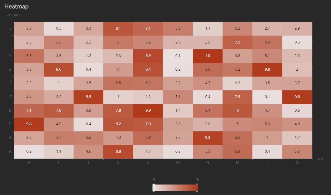
Properties
| Configuration | Description |
|---|---|
|
Title |
Sets the chart title, which appears in the upper-left corner of the chart. |
|
Title Font Size |
Sets the title font size. |
|
Top |
Sets the height of the empty area at the top of the chart. |
|
Bottom |
Sets the height of the empty area at the bottom of the chart. |
|
Left |
Sets the width of the empty area on the left side of the chart. |
|
Right |
Sets the width of the empty area on the right side of the chart. |
|
Animation |
Sets whether to enable chart rendering animation. |
Variable settings
| Configuration | Description |
|---|---|
|
Associated Variables |
Sets the variable controls displayed at the top of the chart. |
|
Variables per Row |
Sets the number of variable controls displayed in each row at the top of the chart. |
|
Label Placeholder |
Sets the percentage of space occupied by the variable label relative to the individual variable control. |
|
Query Button |
Sets whether to display a query button on the right side of the variables:
|
|
Button Text |
Sets the text displayed on the query button. |
Tooltip
| Configuration | Description |
|---|---|
|
Display |
Sets whether to display the tooltip when hovering over a data point. |
X-axis configuration
| Configuration | Description |
|---|---|
|
Type (Non-selectable) |
Only Category axis is supported. |
|
Name |
Sets the axis name. |
|
Font Size |
Sets the font size of the axis text, including the axis name and tick labels. |
|
Font Color |
Sets the color of the axis text, including the axis name and tick labels. |
|
Line Color |
Sets the color of the axis line. |
|
Time Format |
Sets the X-axis time format. The available options are as follows:
|
Y-axis configuration
Note:
Heatmap supports only a single Y-axis.
| Configuration | Description |
|---|---|
|
Type (Non-selectable) |
Only Value axis is supported. |
|
Name |
Sets the axis name. |
|
Font Size |
Sets the font size of the axis text, including the axis name and tick labels. |
|
Font Color |
Sets the color of the tick labels. |
|
Line Color |
Sets the color of the axis line and axis name. |
|
Include Zero |
Sets whether the axis scale must include a zero tick. |
Chart configuration
| Configuration | Description |
|---|---|
|
Dark Color |
Sets the dark color for the heatmap. |
|
Bright Color |
Sets the bright color for the heatmap. |
|
Minimum |
Sets the minimum value for the heatmap, used for color differentiation. |
|
Maximum |
Sets the maximum value for the heatmap, used for color differentiation. |
|
Display Labels |
Sets whether to display labels on the heatmap blocks. |
The configuration for the heatmap does not require selecting data columns or coordinate columns. The horizontal and vertical coordinates displayed in the chart correspond to the row and column labels of the matrix.
Reset
Resets the configuration on the right panel. When the data source changes, you need to reset the configuration to match the latest data source structure.
Configuration Chart
The data source must be a table with two columns: id and value.
Properties
| Configuration | Description |
|---|---|
|
svg Background Image |
Sets the XML text for the SVG vector image. |
|
History Replay |
Sets the script used to query historical replay, supporting the {{time}} variable. |
Data mapping
| Configuration | Description |
|---|---|
|
Text Mapping |
Sets the mapping between the SVG text id and data id. Format: text id: data id. One mapping per line, separated by a colon (e.g., text_id_0: data_id_0). |
|
Color Mapping |
Sets the mapping between the SVG element selector id and data id. Format: element selector id: data id. One mapping per line, separated by a colon (e.g., selector_0: data_id_0). |
Surface Chart
The data source type must be matrix.
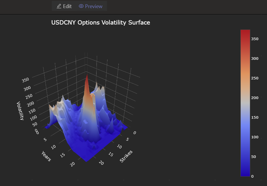
Properties
| Configuration | Description |
|---|---|
|
Title |
Sets the chart title, which will be displayed above the chart. |
|
Title Font Size |
Sets the title font size. |
|
X-Axis Name |
Sets the name of the X-axis. |
|
Y-Axis Name |
Sets the name of the Y-axis. |
|
Z-Axis Name |
Sets the name of the Z-axis. |
Reset
Resets the configuration on the right panel. When the data source changes, you need to reset the configuration to match the latest data source structure.